Log Graphing
Graphing a Log
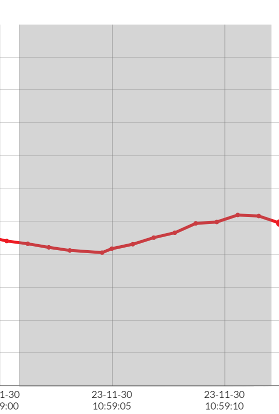
- Logs can contain up to four data sources. Each data source is displayed on its own x-axis that is color coded to match the graph line.
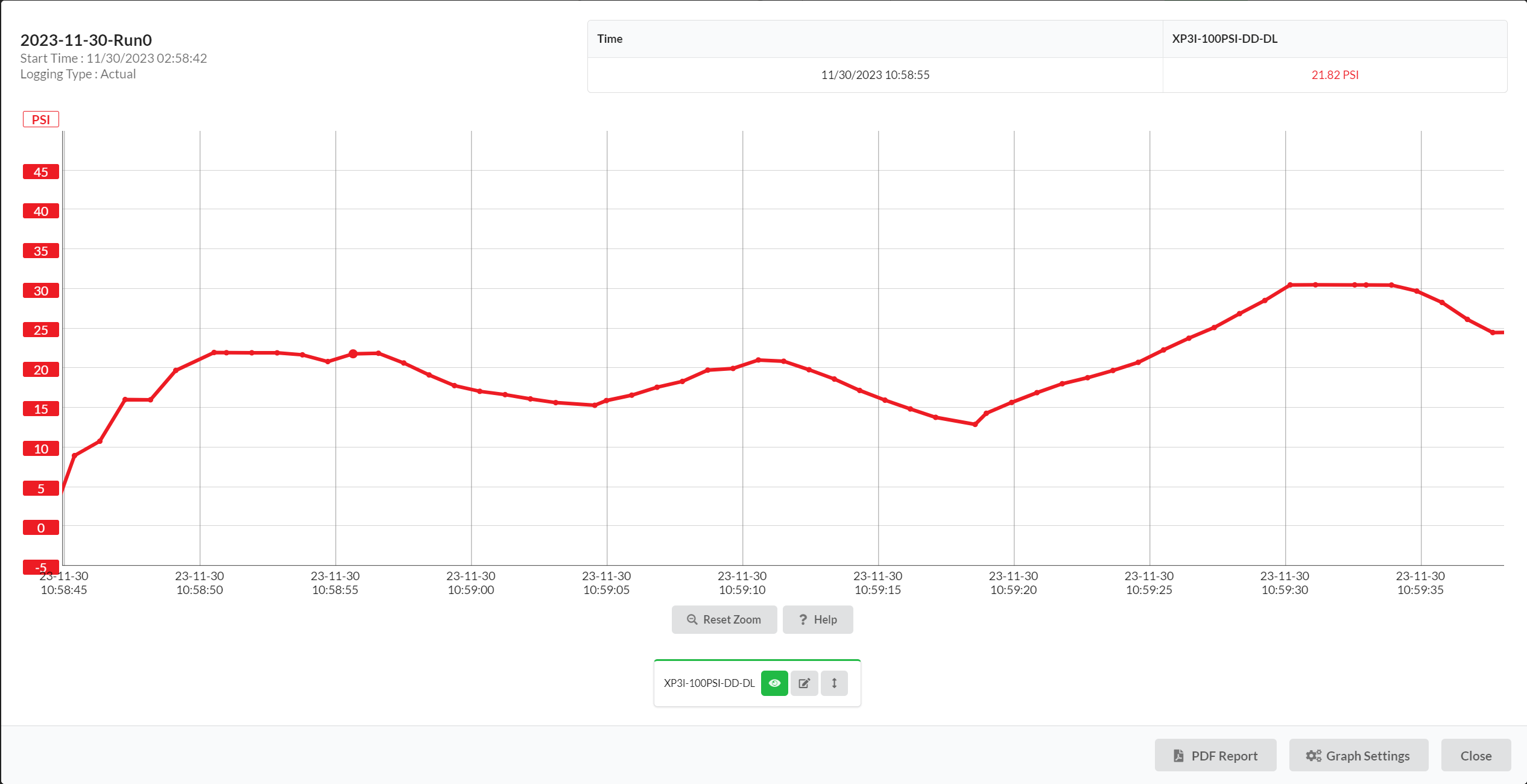
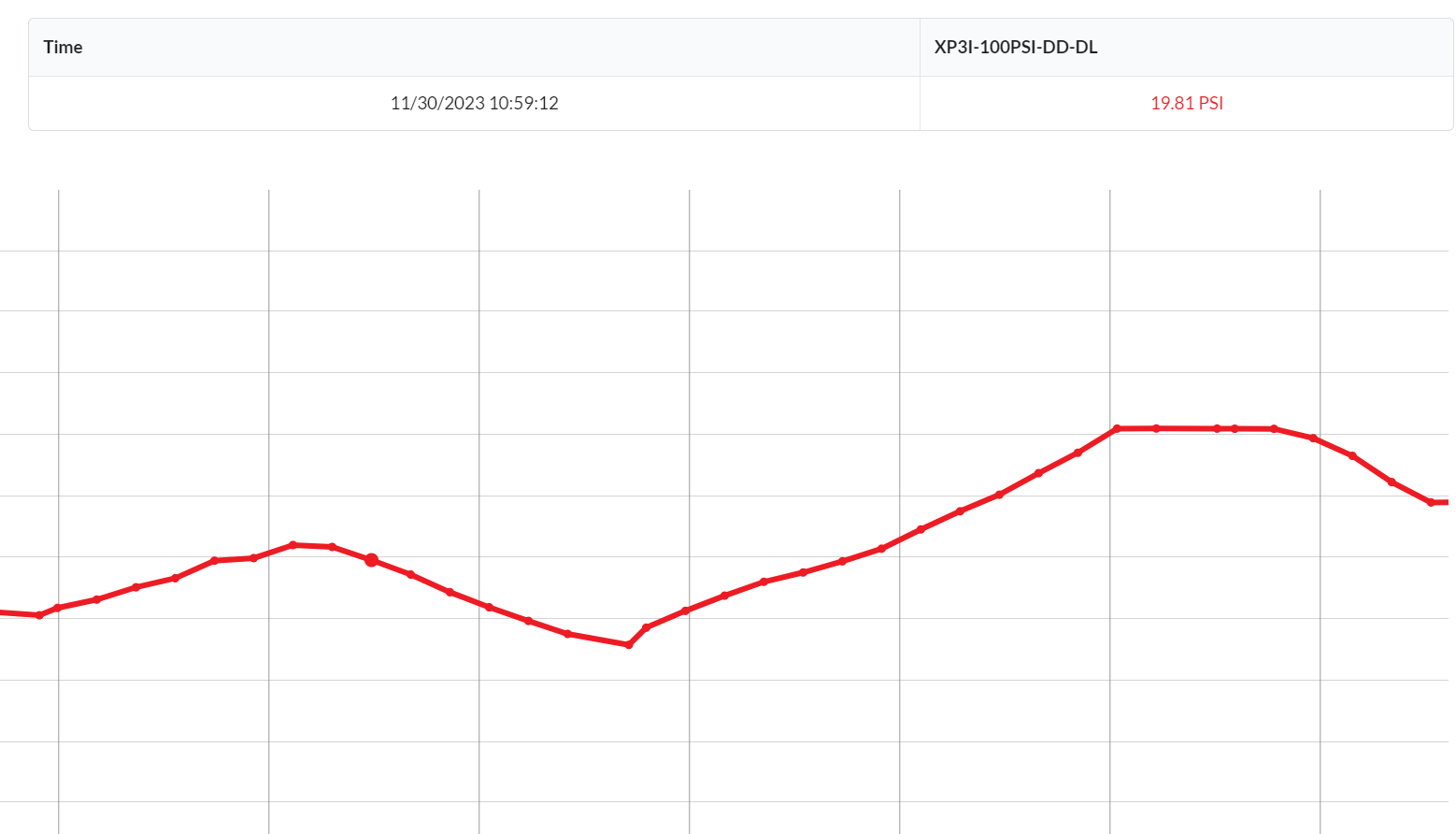
Data Legend
- To get the value of a specific reading, hover over the graph to select a certain point in time. The legend above the graph will display the readings for each data source as well as the time.
Zooming
-
To zoom in on a specific portion of the graph, click and drag across the graph horizontally or vertically to get a closer view of the data. Note : this may change the range of the axes.
-
Double click anywhere on the graph to reset to the full view. Additionally, the reset zoom button
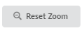 can be used.
Data Sources
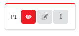
- Each of the available data sources have a control at the bottom of the graph. The color on the control matches the color of the line on the graph.
-
The toggle visibility button
 shows or hides that data source from the graph. Note : if a PDF report is generated
while a data source is hidden, it will not show on the graph in the report.
shows or hides that data source from the graph. Note : if a PDF report is generated
while a data source is hidden, it will not show on the graph in the report. -
The rename sensor button
 allows renaming of the sensor input. This name will be visible on future viewings
of the log.
allows renaming of the sensor input. This name will be visible on future viewings
of the log. -
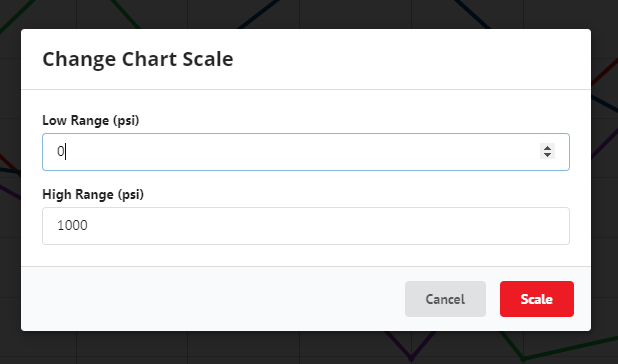
The change chart scale button
 manually changes the range of the y-axis for that data source. This does not affect
the range of y-axes for other data sources.
manually changes the range of the y-axis for that data source. This does not affect
the range of y-axes for other data sources.
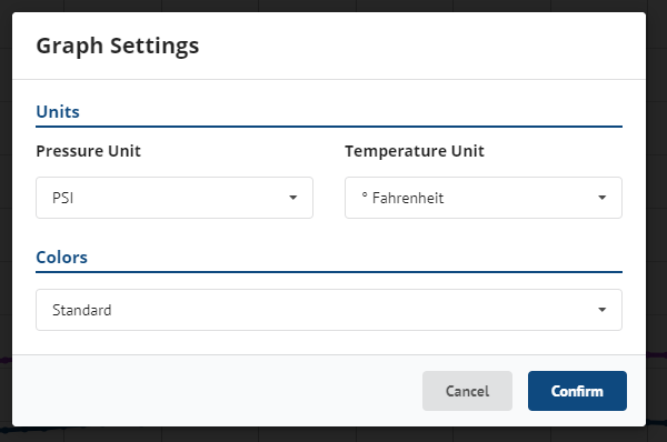
Graph Settings
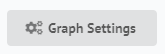
To change the graph settings, click Graph Settings in the bottom right corner
of the graph modal.
-
Updating unit settings will save this to your locale settings. See Locale Settings for more.
-
Changing the color settings allows the use of a colorblind-friendly color pallet.